How to Read and Interpret Trading Charts
Signals, Trading
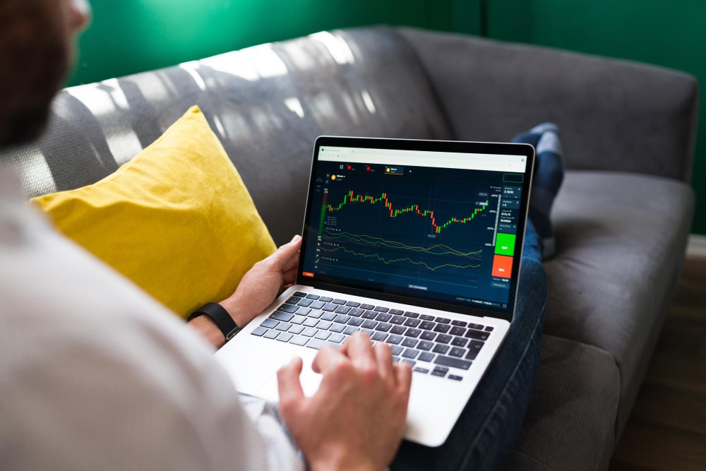
Have you ever opened a crypto exchange, looked at a chart covered in red and green candles, lines, and numbers, and thought, "What am I even looking at?"
Trading charts can feel like reading a foreign language when you're just starting out. All those colors, patterns, and squiggly lines seem overwhelming. But here's the truth: once you understand the basics, charts become one of your most powerful tools for making smart trading decisions.
Charts tell you the story of what's happening with a cryptocurrency's price. They show you where it's been, where it is now, and—with some practice—clues about where it might be heading. Whether you're buying Bitcoin for the first time or trying to figure out when to sell, knowing how to read a chart is essential.
By the end of this article, you'll understand what every element on a chart means, how to spot important patterns, and how to use charts to make better trading decisions.
What Is a Trading Chart?
A trading chart is a visual representation of a cryptocurrency's price over time. Think of it like a graph that shows how the price has moved—whether it went up, down, or stayed flat.
Every exchange and trading platform has charts. When you look at Bitcoin on Coinbase, Binance, or any other platform, you'll see a chart showing its price history.
Here's what charts help you understand:
- Price movement: Is the coin going up, down, or sideways?
- Timing: When did the price spike or crash?
- Patterns: Are there repeating behaviors that might predict future moves?
- Momentum: Is the price moving fast or slowly?
The most important thing to remember is this: charts don't predict the future with certainty. They show you what has happened and help you make educated guesses about what might happen next.
Pro Tip: Start by watching charts without trading. Spend a week just observing how Bitcoin's price moves throughout the day. Notice when it tends to spike, when it drops, and when it stays flat. This builds your intuition before you risk real money.
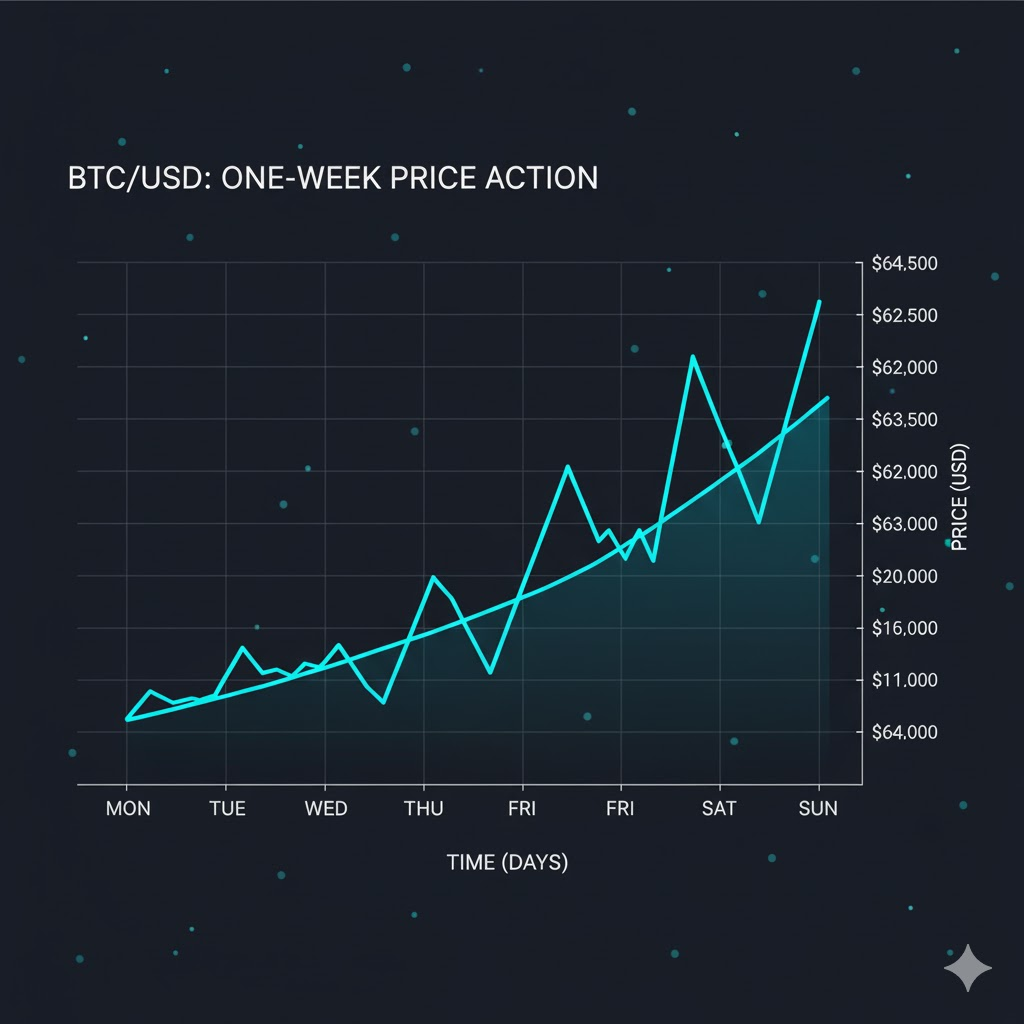
Understanding the Axes: Price and Time
Every trading chart has two axes—just like the graphs you learned about in school.
The vertical axis (Y-axis): Shows the price. This is the value of the cryptocurrency in dollars (or whatever currency you're using). Higher on the chart means higher price, lower means lower price.
The horizontal axis (X-axis): Shows time. This could be minutes, hours, days, weeks, or even months, depending on what timeframe you're viewing.
Let's say you're looking at a Bitcoin chart. On the left side (Y-axis), you might see prices ranging from $45,000 to $50,000. Along the bottom (X-axis), you might see dates like Nov 1, Nov 2, Nov 3, and so on.
When you read the chart, you're seeing how the price changed over time. If the line or candles are higher on the right side than the left, the price went up. If they're lower, the price went down.
Practical example:
Imagine Bitcoin starts the week at $47,000 (left side of the chart). By Friday, it's at $49,500 (right side). The chart shows an upward movement over that week. That's a 5.3% increase.
Simple, right? Once you understand that charts are just tracking price over time, they become a lot less intimidating.
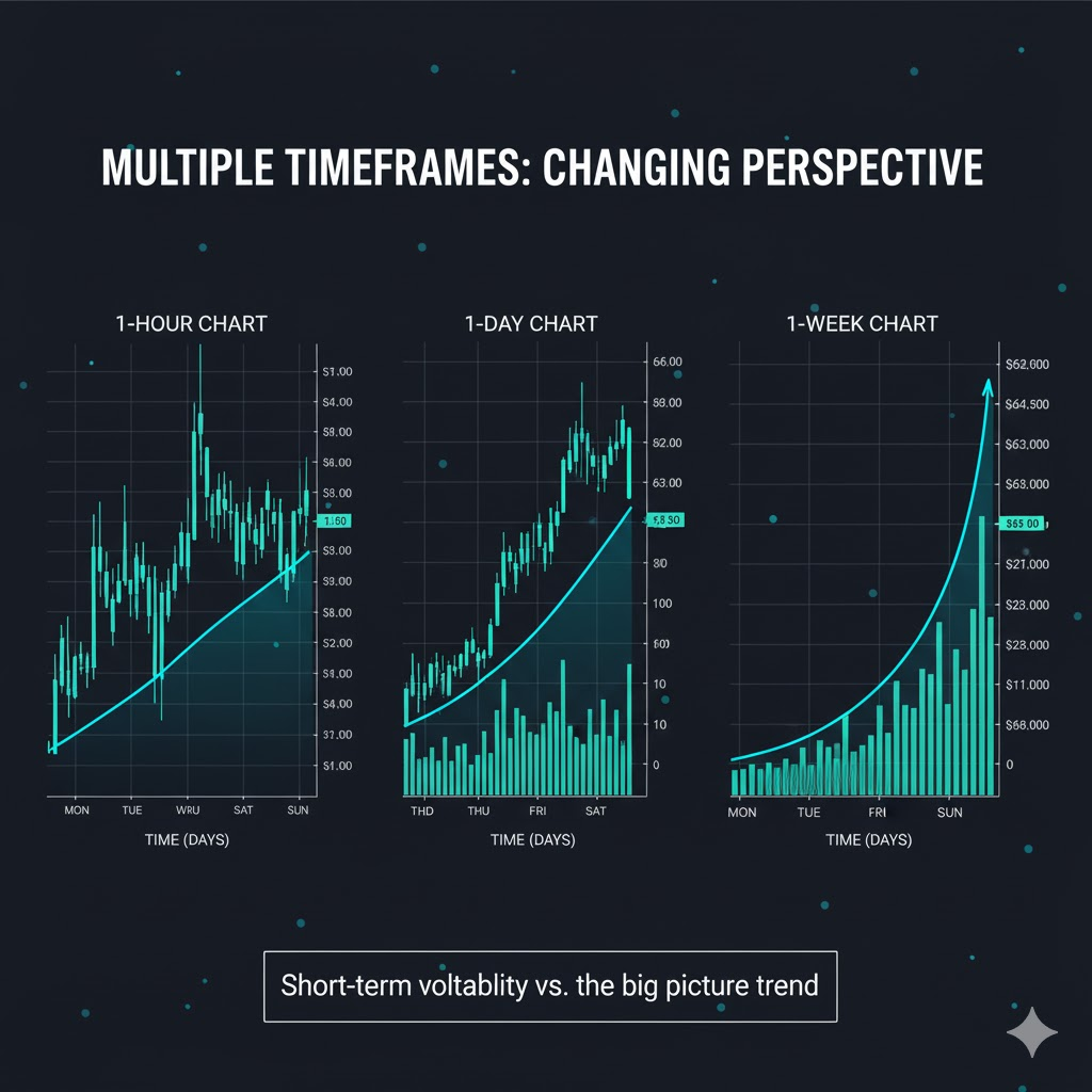
Timeframes: Zooming In and Out
One of the most powerful features of trading charts is the ability to change the timeframe. This lets you zoom in to see minute-by-minute price action or zoom out to see months or years of history.
Common timeframes you'll see:
- 1 minute (1m): Shows price changes every single minute—used by day traders
- 5 minutes (5m): Updates every 5 minutes—still very short-term
- 15 minutes (15m): A slightly broader view of intraday movement
- 1 hour (1h): Good for swing traders looking at daily patterns
- 4 hours (4h): Shows bigger trends within a day
- 1 day (1d): Each candle or data point represents one full day—best for spotting weekly and monthly trends
- 1 week (1w): Each point is a full week—useful for long-term investors
- 1 month (1mo): Shows years of history at a glance
Why does timeframe matter?
The timeframe you choose depends on your trading style. If you're a long-term investor (buying and holding for months), you'll mostly look at daily, weekly, or monthly charts. If you're a day trader (buying and selling within hours), you'll focus on 5-minute, 15-minute, or 1-hour charts.
Practical example:
Let's say you check Bitcoin on a 1-minute chart and see wild swings—it's jumping from $48,000 to $48,200 and back down. That looks scary! But if you zoom out to the 1-day chart, you realize Bitcoin has been stable around $48,000 all week. The 1-minute noise doesn't matter if you're planning to hold for weeks.
Common Mistake: Beginners often get stuck on super short timeframes (1-minute or 5-minute charts) and panic over every tiny move. Unless you're actively day trading, focus on longer timeframes like 1-hour or 1-day charts for clearer trends.
Candlestick Charts: The Most Important Type
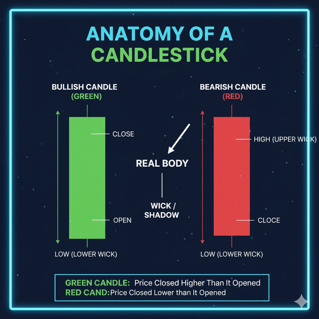
There are different types of charts, but the most popular—and most useful—is the candlestick chart. If you've seen green and red bars on a chart, those are candlesticks.
Each candlestick shows you four key pieces of information about the price during a specific time period:
- Open: The price when the time period started
- Close: The price when the time period ended
- High: The highest price reached during that period
- Low: The lowest price reached during that period
What do the colors mean?
- Green (or white) candlestick: The price went UP during that period. The bottom of the candle is the open price, and the top is the close price.
- Red (or black) candlestick: The price went DOWN during that period. The top of the candle is the open price, and the bottom is the close price.
The wicks (or shadows):
You'll notice thin lines sticking out from the top and bottom of some candles. These are called wicks or shadows. They show you the highest and lowest prices reached during that period, even if the candle didn't close there.
Practical example:
You're looking at a 1-day chart for Ethereum. You see a big green candle on Monday. Here's what it tells you:
- Open: Ethereum started Monday at $3,200 (bottom of the candle)
- Close: Ethereum ended Monday at $3,400 (top of the candle)
- High: The upper wick shows it touched $3,450 at some point during the day
- Low: The lower wick shows it dipped to $3,150 before recovering
So in one glance, you know Ethereum had a strong day, closing up $200, but it was volatile—dropping to $3,150 and spiking to $3,450 before settling at $3,400.
Pro Tip: Long wicks can tell you a lot. A long upper wick means buyers tried to push the price higher but failed—sellers took control. A long lower wick means sellers tried to push the price down but buyers stepped in and defended that level.
Reading Candlestick Patterns
Once you understand individual candles, you can start spotting patterns—groups of candles that often signal what might happen next.
Here are a few basic patterns every beginner should know:
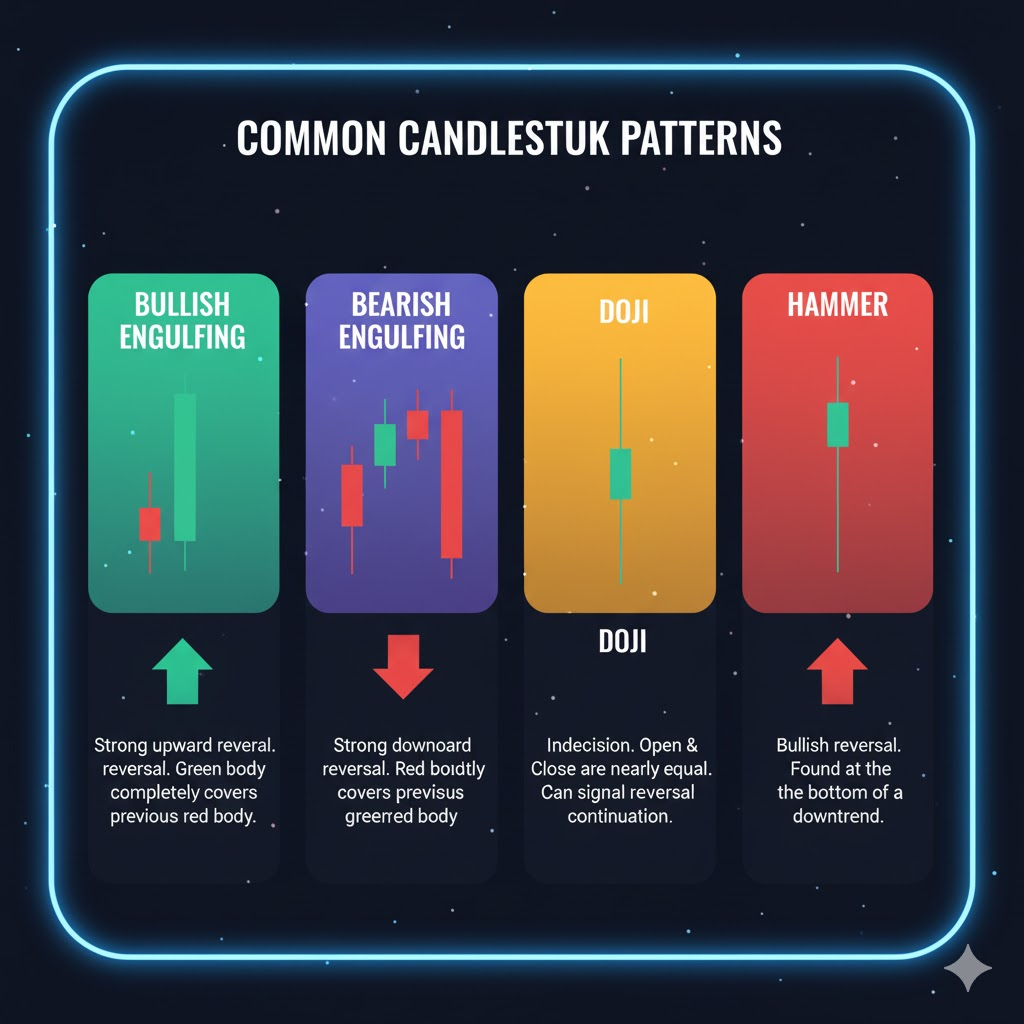
1. Bullish Engulfing
What it looks like: A small red candle followed by a big green candle that completely "engulfs" the red one.
What it means: Buyers are taking control. This often signals the price is about to go up.
Example: Bitcoin has been dropping for a few days. You see a small red candle on Tuesday, then on Wednesday, a huge green candle appears that's twice the size. That's a bullish engulfing pattern—a potential buy signal.
2. Bearish Engulfing
What it looks like: A small green candle followed by a big red candle that swallows it.
What it means: Sellers are taking over. The price might be heading down.
Example: Ethereum has been climbing steadily. Then you see a small green candle followed by a massive red candle. That's a bearish engulfing—a warning that the uptrend might be ending.
3. Doji
What it looks like: A candle with almost no body—just a cross or plus sign. The open and close prices are nearly identical.
What it means: Indecision. Buyers and sellers are in a tug-of-war, and nobody's winning. Often appears before a big move up or down.
Example: Bitcoin has been trading sideways at $50,000. You see several doji candles in a row. This indicates that the market is waiting for something—news, momentum, or a catalyst—before deciding on a direction.
4. Hammer
What it looks like: A small body at the top of the candle with a long lower wick—looks like a hammer.
What it means: Sellers tried to push the price down hard, but buyers fought back and recovered. This is often a bullish signal at the bottom of a downtrend.
Example: Solana has been dropping from $120 to $100. At $100, you see a hammer candle—sellers pushed it down to $95, but buyers brought it back to $100 by the end of the day. This suggests $100 is strong support, and the price might bounce back up.
Common Mistake: Don't rely on a single candlestick pattern to make trading decisions. Patterns are clues, not guarantees. Always look at the bigger picture—what's the overall trend? What's the volume? What's happening in the news?
Volume: The Missing Piece
Here's something beginners often overlook: volume. Volume shows you how many coins were traded during a specific time period. It's usually displayed as bars at the bottom of the chart.
Why does volume matter?
Volume tells you the strength behind a price move. A big price increase with high volume means lots of people are buying—that's a strong, believable move. A big price increase with low volume? That's weak—it might not last.
Think of volume like the energy behind a sports team's cheer. A loud, energetic crowd means the team has momentum. A quiet crowd means the excitement is fading.
Practical example:
Bitcoin jumps from $48,000 to $50,000 in one day. You check the volume and see it's three times higher than normal. That tells you this isn't a fake-out—lots of traders are buying, and the move has real strength behind it.
But if Bitcoin jumps to $50,000 and volume is half the usual amount? Be cautious. The move might be driven by a small group of traders, and it could reverse quickly.
Pro Tip: When you spot a breakout (the price breaking through a key level like resistance), always check the volume. High volume confirms the breakout is real. Low volume suggests it might be a false breakout.
![Chart showing Bitcoin price with volume bars at the bottom—highlighting a price spike with high volume (tall bars) vs a price spike with low volume (short bars)]](https://www.fatpigsignals.com/wp-content/uploads/2025/11/image-13.png)
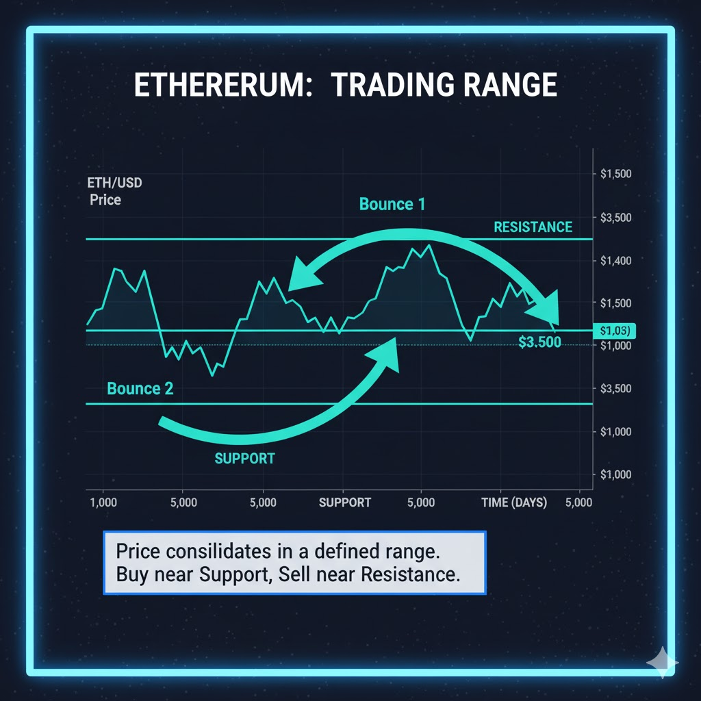
Support and Resistance: Key Levels on Charts
Two of the most important concepts in chart reading are support and resistance.
Support: A price level where the coin tends to stop falling and bounce back up. Think of it like a floor that catches the price.
Resistance: A price level where the coin tends to stop rising and pull back down. Think of it like a ceiling the price keeps bumping into.
Why do these levels exist?
Support and resistance form because traders remember past prices. If Bitcoin dropped to $45,000 twice before and bounced back both times, traders start to believe $45,000 is a strong support level. When it approaches $45,000 again, buyers jump in, expecting another bounce.
The same logic applies to resistance. If Bitcoin failed to break above $52,000 three times, traders believe that level is tough to crack. When it approaches $52,000 again, some traders sell, expecting it to drop again.
Practical example:
You're watching Ethereum. You notice that every time it drops to $3,000, it bounces back up. That's support at $3,000. You also notice that every time it climbs to $3,500, it gets rejected and drops. That's resistance at $3,500.
So you develop a simple strategy: buy near $3,000 (support) and sell near $3,500 (resistance). As long as Ethereum stays in this range, this strategy works.
What happens when support or resistance breaks?
This is where things get interesting. If Ethereum finally breaks above $3,500 with strong volume, that resistance becomes new support. The price that was once a ceiling is now a floor.
The same is true in reverse. If Ethereum breaks below $3,000, that support becomes new resistance. It's now harder to get back above $3,000.
Common Mistake: Don't expect support and resistance to be exact numbers. They're more like zones. Instead of thinking "$3,000 is support," think "$2,980 to $3,020 is the support zone."
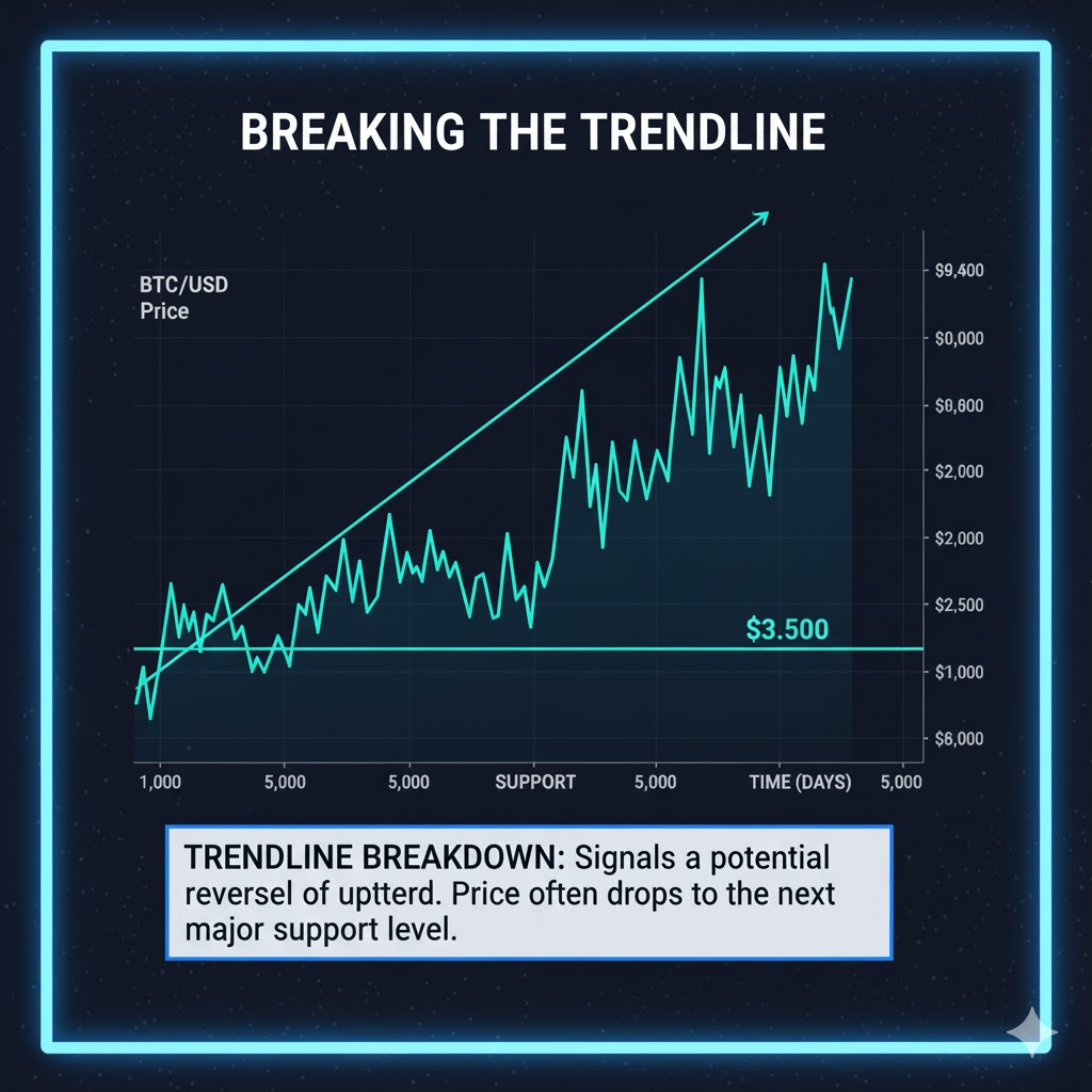
Trendlines: Connecting the Dots
A trendline is a diagonal line you draw on a chart to show the direction of the price. Trendlines help you visualize whether the price is trending up, down, or sideways.
Uptrend line: Connect the low points (bottoms) on a chart during an uptrend. The line slopes upward. As long as the price stays above this line, the uptrend is intact.
Downtrend line: Connect the high points (tops) on a chart during a downtrend. The line slopes downward. As long as the price stays below this line, the downtrend continues.
Practical example:
Bitcoin has been rising for weeks. You draw a trendline connecting the lowest points—$45,000, $46,500, $48,000. The line slopes up. As long as Bitcoin stays above this line, you know the uptrend is still strong.
But one day, Bitcoin drops below the trendline. That's a warning signal. The uptrend might be breaking down, and you should be cautious about buying more.
Pro Tip: The more times a trendline is "touched" by the price, the stronger it is. If Bitcoin bounces off an uptrend line five times, that line is very important. If it breaks, it's a significant event.
Putting It All Together: Reading a Real Chart
Let's walk through how you'd analyze a real chart step by step.
Scenario: You're considering buying Cardano (ADA). Here's what you do:
Step 1: Choose your timeframe. Since you're planning to hold for a few weeks, you look at the 1-day chart.
Step 2: Identify the trend. You see that Cardano has been climbing from $0.45 to $0.55 over the past month. The trend is upward.
Step 3: Find support and resistance. You notice Cardano bounced off $0.50 three times—that's support. It also struggled to break above $0.58 twice—that's resistance.
Step 4: Check the candlesticks. Today's candle is green and strong, with no long upper wick. This suggests buyers are in control and there's no major rejection at current prices.
Step 5: Look at volume. Volume is above average today, confirming that the upward move has strength.
Step 6: Make your decision. Based on this analysis, you decide to buy Cardano at $0.55 (current price), set a stop loss at $0.49 (just below support), and plan to sell near $0.58 (resistance). This gives you a clear entry, exit, and risk management plan.
See how all the pieces come together? You're not guessing—you're using the chart to make an informed decision.
Quick Recap
Here's what we covered:
- Trading charts show price over time—the vertical axis is price, the horizontal axis is time
- Timeframes let you zoom in (1-minute, 1-hour) or out (1-day, 1-week), depending on your trading style
- Candlesticks show open, close, high, and low prices—green means up, red means down
- Candlestick patterns like bullish engulfing, bearish engulfing, doji, and hammer signal potential price moves
- Volume shows trading activity—high volume confirms strong moves, low volume suggests weakness
- Support and resistance are key price levels where the coin tends to bounce or get rejected
- Trendlines connect highs or lows to visualize the direction of the trend
- Put it all together by analyzing trend, support/resistance, candlesticks, and volume before making trading decisions
Conclusion & Next Steps
Learning to read trading charts is one of the most valuable skills you can develop as a crypto trader. At first, charts might seem complicated, but once you break them down into their basic parts—candlesticks, volume, support, resistance, trends—everything starts to make sense.
The best part? This skill compounds over time. The more charts you study, the faster you'll spot patterns and make confident decisions. Don't expect to master chart reading overnight. It takes practice. But every hour you spend analyzing charts makes you a better trader.
Your Next Steps:
- Today: Open TradingView (it's free) or your exchange's chart feature. Pull up Bitcoin or Ethereum and just watch. Identify the trend. Find one support level and one resistance level. That's it—just practice observing.
- This Week: Analyze 3-5 different coins. For each one, write down: Is it trending up, down, or sideways? Where's the nearest support? Where's the nearest resistance? What's the volume telling you?
- Ongoing: Make chart reading a daily habit. Spend 10 minutes each morning reviewing charts before the market gets too active. Over time, you'll develop an intuition for reading price action that will serve you in every trade you make.
Remember: You don't have to figure this out alone. Our Fat Pig Signals community is full of traders who are learning to read charts just like you. We share chart setups, discuss patterns, and help each other spot opportunities without the hype and confusion.
Join our Telegram group here and get access to real-time chart analysis, beginner-friendly breakdowns, and a supportive community that's got your back.
Disclaimer: This article is for educational purposes only and should not be considered financial advice. Cryptocurrency trading involves substantial risk of loss. Always do your own research and consider consulting with a financial advisor before making investment decisions.
Related Articles

Fundamental Analysis vs Technical Analysis in Crypto
Position Sizing: How to Calculate Your Trade Size