How to Read Crypto Charts for Beginners
Cryptocurrencies, Signals, Trading
You open a crypto exchange for the first time.
There's a chart on the screen. Red and green bars going up and down. Lines crossing each other. Numbers you don't recognise. It looks like something from a Bloomberg / Wall Street terminal — complicated, intimidating, and completely alien.
Here's the truth: it's not that complicated once someone explains it properly.
Every professional crypto trader started exactly where you are now — staring at a chart with no idea what any of it means. The difference is they eventually learned to read the story the chart is telling. And once you see it, you can't unsee it.
By the end of this guide, you'll understand what candlesticks are, how to spot support and resistance levels, what volume means, and how to read the overall trend — the four core skills that underpin almost all crypto chart analysis.
Let's start from zero.
What Is a Crypto Chart?
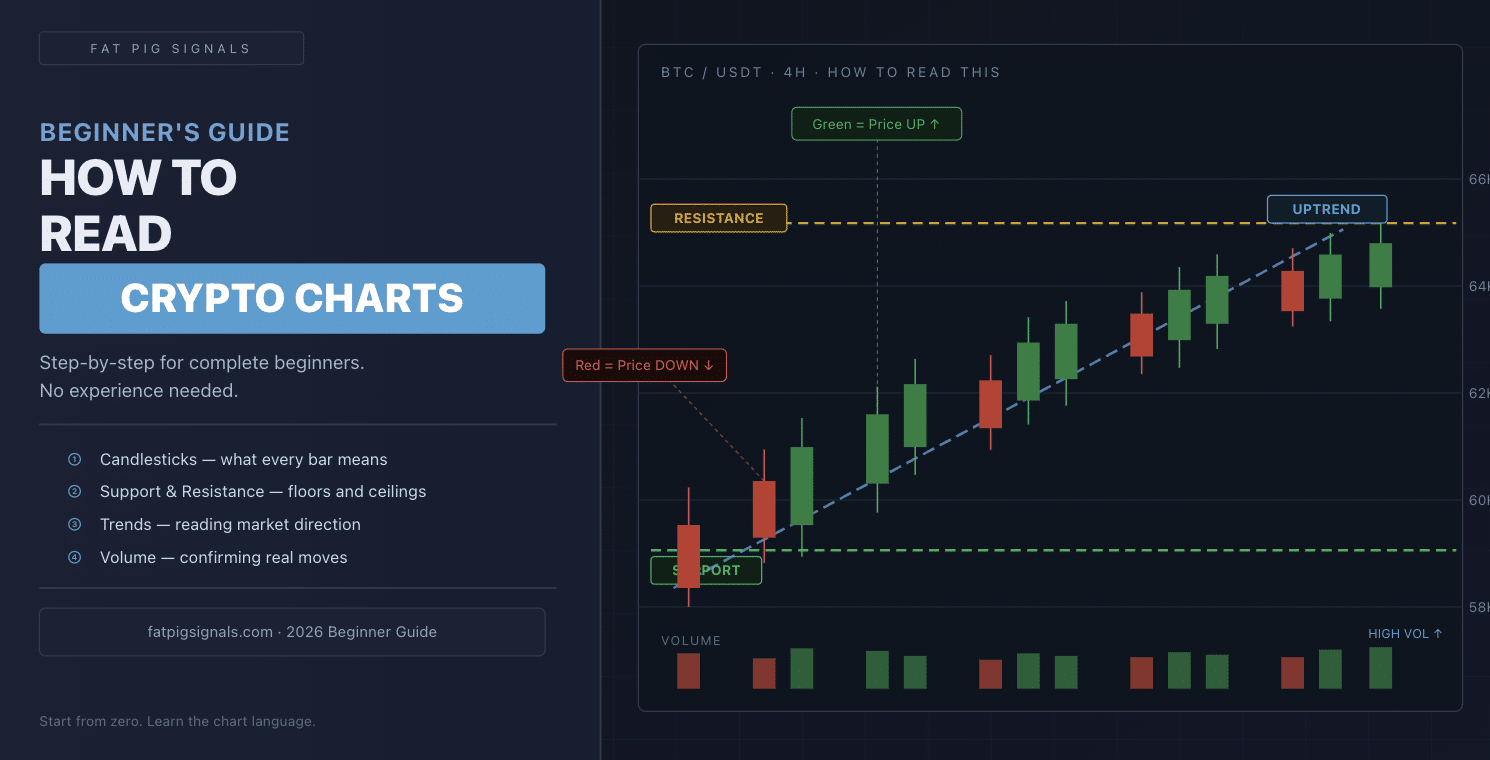
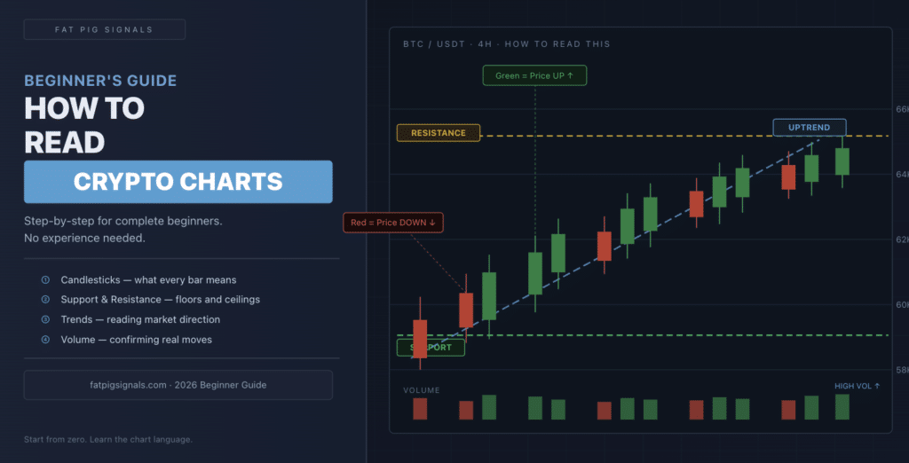
A crypto chart is a visual record of a coin's price over time.
That's it. Every candle, line, and bar on the screen is just showing you: where was the price before, and where is it now?
The horizontal axis (left to right) shows time. The vertical axis (bottom to top) shows price. Every point on the chart represents what a coin was worth at that moment in time.
The most common type of chart you'll encounter is the candlestick chart — and that's where we'll start.
Part 1: Understanding Candlesticks
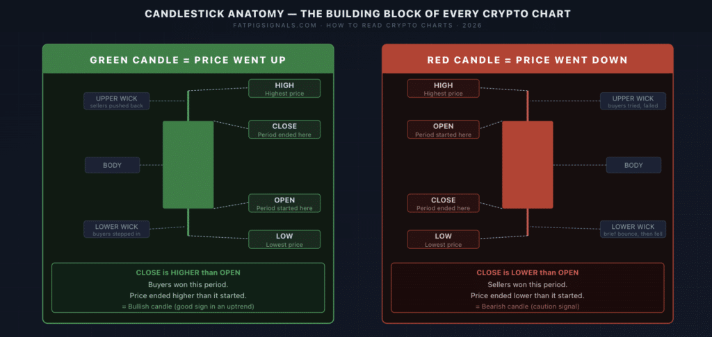
Candlesticks are the building blocks of crypto charts. Every single "candle" tells you four things about what happened during a specific period of time:
- Open — the price when the time period started
- Close — the price when the time period ended
- High — the highest price reached during that period
- Low — the lowest price reached during that period
The thick part of the candle (called the body) shows the distance between the open and close. The thin lines sticking out above and below (called wicks or shadows) show the high and low.
Green candle = price went UP during that period. The price closed higher than it opened. Buyers were in control.
Red candle = price went DOWN during that period. The price closed lower than it opened. Sellers were in control.
Here's a practical example. Imagine Bitcoin's 4-hour candle:
- Opens at $62,000
- Climbs as high as $63,500 during those 4 hours
- Dips as low as $61,200
- Closes at $62,800
That candle would be green (closed higher than opened), with a wick above at $63,500 and a wick below at $61,200.
Pro Tip: The length of the wick tells you something important. A long wick above a candle means the price tried to go higher but got pushed back down — sellers stepped in. A long wick below means the price tried to drop but buyers pushed it back up. Wicks reveal the battle between buyers and sellers.
Part 2: Timeframes — Choosing Your View
Before you can read a chart, you need to know what timeframe you're looking at.
A timeframe is how much time each candle represents. Common timeframes are:
- 1 minute (1M) — each candle = 1 minute of price action
- 15 minutes (15M) — each candle = 15 minutes
- 1 hour (1H) — each candle = 1 hour
- 4 hours (4H) — each candle = 4 hours
- 1 day (1D) — each candle = one full day
Think of timeframes like zoom levels on a map. A 1-minute chart is zoomed all the way in — you see every tiny price movement in detail. A daily chart is zoomed out — you see the big picture over months.
The same Bitcoin chart looks completely different depending on the timeframe you choose.
Which timeframe should beginners use?
Start with the 4-hour (4H) chart. It filters out the noise of short-term price swings, but still gives you enough detail to understand what's happening. Many professional traders use the 4H chart as their main analysis view.
Common Mistake: Beginners often stare at 1-minute charts and panic at every tiny move. The 1-minute chart is full of noise — random fluctuations that don't mean anything. Zoom out to 4H or 1D before making any decisions.
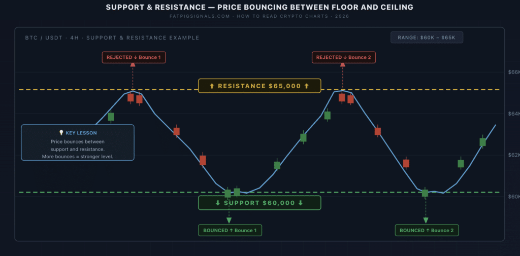
Part 3: Support and Resistance — The Most Important Concept on Any Chart
If you only learn one thing from this guide, make it this.
Support is a price level where buying pressure is strong enough to stop the price from falling further. Think of it as the floor — every time the price drops to that level, buyers step in and push it back up.
Resistance is a price level where selling pressure is strong enough to stop the price from rising further. Think of it as the ceiling — every time the price rises to that level, sellers step in and push it back down.
Here's a real example:
Imagine Bitcoin keeps bouncing between $60,000 and $65,000. Every time it drops to $60,000, buyers rush in and the price recovers. Every time it rises to $65,000, sellers take profit and the price falls back.
In this case:
- $60,000 = support (the floor)
- $65,000 = resistance (the ceiling)
These levels matter because price remembers them. A level that acted as resistance in the past often becomes support once the price breaks above it — and vice versa.
Why? Because it's all about human psychology. Traders who missed the original move remember those price points. When price returns to them, buying and selling decisions cluster around the same levels again.
How to spot support and resistance:
Look for price levels where the chart has bounced or reversed multiple times. The more times a level has been tested and held, the more significant it is.
Part 4: Trend Lines — Which Direction Is the Market Moving?
A trend is simply the overall direction the price is moving over time.
There are three types:
- Uptrend — the chart is making higher highs and higher lows. Each peak is higher than the last. Each dip is higher than the last dip. The market is climbing.
- Downtrend — the chart is making lower highs and lower lows. Each peak is lower than the last. Each dip is lower than the last. The market is falling.
- Sideways (ranging) — the price is moving horizontally between support and resistance with no clear direction. This is the most common condition.
Why does trend matter?
There's an old trading saying: "The trend is your friend." It means: don't fight the direction the market is already moving in. If Bitcoin is in a clear uptrend, looking for buy opportunities makes more sense than trying to short it. If it's in a downtrend, being cautious about buying makes sense.
How to draw a trend line:
For an uptrend, connect the lows. Find the two lowest dip points on the chart and draw a line through them. If the price respects that line (bounces off it), it's a valid uptrend line.
For a downtrend, connect the highs. Find the two highest peak points and draw a line through them.
Pro Tip: A trend line only becomes valid after the price touches it at least twice. One point is just a dot. Two points make a line. Three or more make a pattern worth paying attention to.
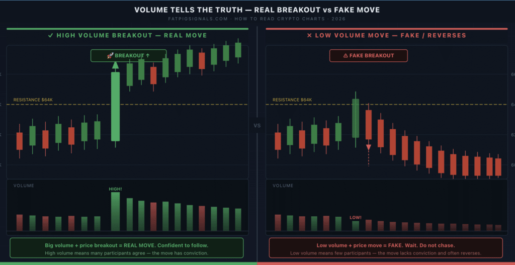
Part 5: Volume — Is the Move Real?
Volume is the total amount of a coin that was bought and sold during a specific period. On most charts, you'll see it displayed as vertical bars along the bottom of the screen.
High volume means a lot of people were trading during that period. Low volume means very few people were active.
Here's why volume matters: it confirms whether a price move is real or fake.
Imagine Bitcoin jumps from $62,000 to $66,000 in one day. Is that a strong, real move — or is it just a few large traders temporarily pushing the price up?
Check the volume:
- High volume on the way up = many buyers stepped in, the move is likely genuine
- Low volume on the way up = very few participants, the move may not last
The same logic applies to drops. A crash on high volume is more serious than a crash on low volume.
Think of volume like crowd size at a sports match. A goal scored in front of 80,000 roaring fans feels significant. The same goal scored in an empty stadium feels hollow. Price moves on high volume carry more weight.
Putting It All Together: Reading a Chart in 4 Steps
Next time you open a crypto chart, run through this sequence:
Step 1 — Set your timeframe. Start with the 4H or 1D chart to get the big picture. Don't start on 1-minute.
Step 2 — Identify the trend. Is the chart making higher highs and higher lows (uptrend)? Lower highs and lower lows (downtrend)? Or moving sideways?
Step 3 — Mark support and resistance. Look for price levels the chart has bounced off multiple times. Mark them with horizontal lines. These are your key zones.
Step 4 — Check volume. Is volume rising or falling? Does it confirm the recent price moves? High volume moves are more significant than low volume moves.
That's your basic chart reading framework. Four steps. Every time.
Quick Recap
Here's what we covered:
- Candlesticks show open, close, high, and low for each time period. Green = price went up. Red = price went down. Wicks show the battle between buyers and sellers.
- Timeframes are zoom levels. Start with 4H or 1D. Avoid 1-minute noise as a beginner.
- Support is the floor — a price level where buyers step in. Resistance is the ceiling — where sellers push back.
- Trends show direction: uptrend (higher highs, higher lows), downtrend (lower highs, lower lows), or sideways.
- Volume confirms moves. High volume = real, meaningful move. Low volume = treat with caution.
Your Next Steps
1. Today: Open a free TradingView account (tradingview.com) and pull up a Bitcoin chart on the 4H timeframe. Just observe — don't trade. Try to identify one support level and one resistance level. Draw horizontal lines where you think they are.
2. This week: Watch how the price reacts when it approaches your support and resistance levels. Does it bounce? Does it break through? You're learning to read the chart's "memory."
3. When you're ready: Start following how professional traders use these concepts in real trades. The Fat Pig Signals free Telegram group posts structured signal calls with entry, stop loss, and take profit levels — watching how those levels relate to support and resistance on the chart will accelerate your learning dramatically.
Join the free Fat Pig Signals Telegram →
Reading charts is a skill, not a talent. Every chart looks like random noise at first. After a few weeks of daily observation, patterns start to appear. After a few months, you'll wonder how you ever didn't see them.
Start today. It gets easier every single time you look.
Disclaimer: This article is for educational purposes only and should not be considered financial advice. Cryptocurrency trading involves substantial risk of loss. Always do your own research and consider your risk tolerance before trading.
Related Articles

How to discover the best crypto to watch: useful tips

Bitcoin Options Strategy that Lets Traders Profit While Also Hedging